Table of Contents
1 | Introduction to Design Tokens
2 | Managing and Exporting Design Tokens With Style Dictionary
3 | Exporting Design Tokens From Figma With Style Dictionary
4 | Consuming Design Tokens From Style Dictionary Across Platform-Specific Applications
5 | Generating Design Token Theme Shades With Style Dictionary
6 | Documenting Design Tokens With Docusaurus
7 | Integrating Design Tokens With Tailwind
8 | Transferring High Fidelity From a Design File to Style Dictionary
9 | Scoring Design Tokens Adoption With OCLIF and PostCSS
10 | Bootstrap UI Components With Design Tokens And Headless UI
11 | Linting Design Tokens With Stylelint
12 | Stitching Styles to a Headless UI Using Design Tokens and Twind
What You’re Getting Into
In a previous article, I mentioned that a perk of using Style Dictionary is that it serves as a central place to document your design tokens and the generated platform deliverables.
With a little bit of work, we can create a site to provide a visual enhancement to this documentation.

We can create something similar to the graphic above where it lists outs all the tokens that are part of the design system.
From what I’ve written about consuming design tokens across applications of different platforms, we should have all the skills to build a documentation site.
We would just add a job to a GitHub Actions workflow that delivers the generated design tokens to a repository for a documentation site.
The repository could be a site that utilizes GitHub Pages, Gatsby, Next.js, or any other framework to provide a visual display for the platform deliverables generated by a style dictionary.
In this article, we will not try out all the possible ways in which you can build a documentation site.
Rather, we’ll walk through using Docusaurus, a framework for generating a fast documentation site built with React and following the Jamstack architecture.
You can read the documentation for a comparison between other alternatives.
The TL;DR is that it is open-source and is optimized for the specific niche of documentation sites.
Getting Our Bearings With Docusaurus
First things first, we’ll create a new Docusaurus project:
npx @docusaurus/init@latest init design-tokens-documentation classic
In the snippet above, design-tokens-documentation is the arg
representing the name of our project. classic refers to the theme
we want to use (facebook and bootstrap are the two
alternative themes).
Change into the new design-tokens-documentation directory and
open the project in a code editor.
As the documentation outlines, the project has the following structure:
design-tokens-documentation
├── blog
│   ├── 2019-05-28-hola.md
│   ├── 2019-05-29-hello-world.md
│   └── 2020-05-30-welcome.md
├── docs
│   ├── doc1.md
│   ├── doc2.md
│   ├── doc3.md
│   └── mdx.md
├── src
│   ├── css
│   │   └── custom.css
│   └── pages
│       ├── styles.module.css
│       └── index.js
├── static
│   └── img
├── docusaurus.config.js
├── package.json
├── README.md
├── sidebars.js
└── yarn.lock
In short, we can see that an example site has been generated.
Let’s see the site in the browser before we dive deeper into what exactly has been generated.
It appears to have generated a home screen with navigation, header, some content, and a footer.
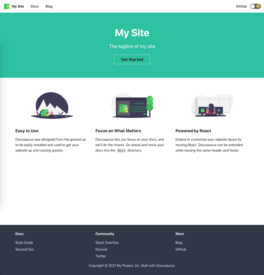
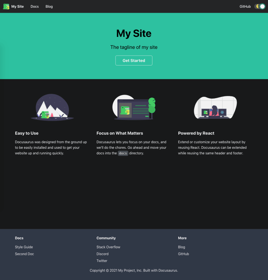
It also comes with a dark mode toggle. 🎉
Clicking on the “Docs” link in the navigation, it looks like a standard, yet sleek, documentation site example.
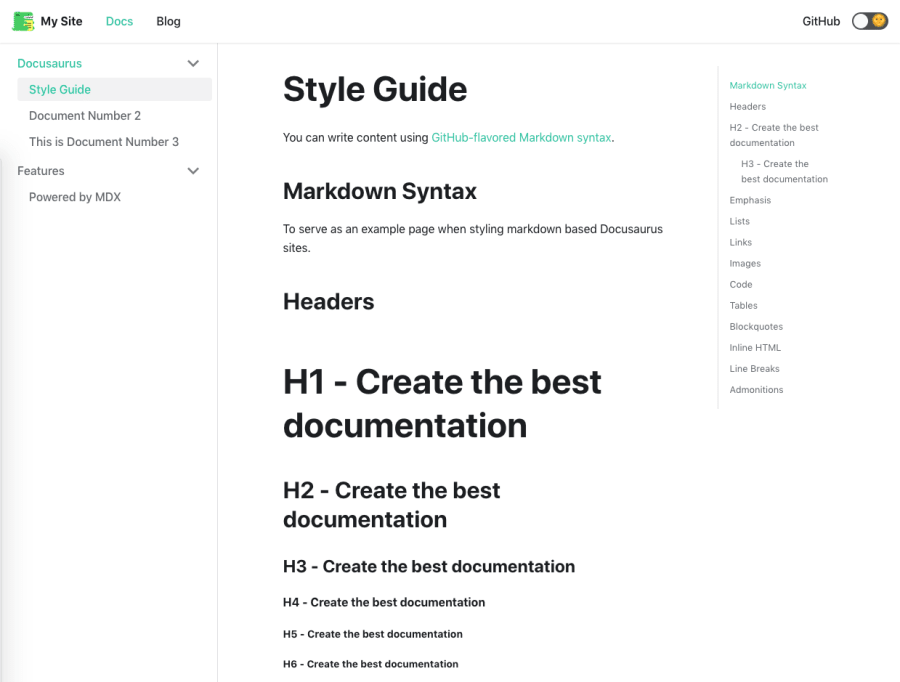
It seems that the documentation pages are generated from GitHub-flavored Markdown.
There are some nice touches like a sidebar to the left for structuring the documentation and a table of contents for the current article to the right.
Clicking on the “Blog” link in the navigation, it looks like another standard, yet sleek, page, this time for blog posts.

Now that we have our bearings, we can review the code that was generated when we initialized the project.
sidebars.js contains the configuration for sidebars that you can
have for your documentation (the “Docs” page).
module.exports = {
  someSidebar: {
    Docusaurus: ['doc1', 'doc2', 'doc3'],
    Features: ['mdx'],
  },
};
someSidebar is an object representing the organization of the
sidebar used in the Docs page.
Docusaurus is a list containing the names of some Markdown files
found in the docs folder. This drives the visual experience of a
dropdown in the sidebar with links using the titles in the matching Markdown
files.
The same goes for the other dropdown Features.
docusaurus.config.js reveals some more information about how this
is all coming together.
In that file, some basic site metadata is configured such as the title, tagline, URL, etc.
There is also a themeConfig property that drives the look and
functionality of the navigation and footer.
The presets property associates the sidebar in
sidebars.js with the Docs page. It also associates an
editUrl for the Docs and Blog pages so anyone can update the
post.
Finally, the src/pages folder contains non-documentation pages,
including the home page.
Of course, you can read the official documentation for even more details.
Design Tokens Documentation
Now that we have an understanding of how Docusaurus works, we could move along to updating the site for our design token documentation.
How one goes about updating the site will vary between use cases.
Some teams might want to leverage this technology to create the design system documentation. In those scenarios, there is going to be a lot more going on than documenting the design tokens that are exported by Style Dictionary.
I won’t cover what goes into all that, but I will make some suggestions as to what should be documented that pertains to Style Dictionary and the deliverables it exports.
After that, we can work together to add a documentation page that integrates with the deliverables from Style Dictionary.
Documentation Ideas
First, you could document the overview of the design to the developer process.
This would include a description of how design token files are generated from a design file that contains the specifications for the design system.
Additionally, it would include a description of how the generated design tokens are imported into a Style Dictionary repository. It would also describe the automation that occurs to transform those imported design tokens and then export them using a GitHub Actions workflow.
As I mentioned in my article on this automation, a new job will have to be registered in a GitHub Actions workflow for every consuming application that wants a platform deliverable.
Therefore, there should be documentation on a process describing how a team/application can “subscribe” to the Style Dictionary repository and get a platform deliverable via a new job in the workflow.
You can even create a visual tool for generating/modifying the GitHub Actions workflows.
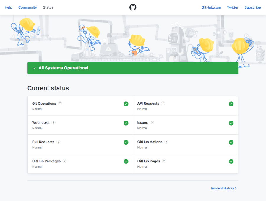
Finally, you may want to include a page displaying the health status of systems that are relied upon to perform the design to developer handoff such as GitHub APIs and the serverless function used to transmit design tokens from a design file to the Style Dictionary repository.
Documenting Design Tokens
With some real-world documentation suggestions aside, let’s dive back into documenting the actual design tokens.
First things first, push your local Docusaurus project to a GitHub repository.
Next, fork my style-dictionary repository if you haven’t already
and create a new branch off of
the latest branch.
I’ll be naming my new branch
documenting-design-tokens-with-docusaurus after this article.
On this branch, we’ll update the GitHub Actions workflow that delivers the platform deliverables from Style Dictionary to consuming applications.
We’ll want to add a job that delivers it to the Docusaurus repository that we just created.
Here the starter for my Docusaurus repository: https://github.com/michaelmang/design-tokens-documentation
In the style-dictionary branch, update the
deliver-tokens-to-consumer.yml file so that it has a job that
will deliver the output/css/_variables.css file to the Docusaurus
repository.
Here’s what the diff looked like for me:
name: Deliver Tokens To Consumer
'on':
  push:
    paths:
      - output/**
jobs:
-  deliver_to_react_application:
+  deliver_to_docusaurus:
    runs-on: ubuntu-latest
    steps:
      - uses: actions/checkout@v2
      - name: Deliver Platform Deliverable To Application
        uses: andstor/copycat-action@v3
        with:
          personal_token: '${{ secrets.API_TOKEN_GITHUB }}'
-          src_branch: generating-design-token-theme-shades-with-style-dictionary
+          src_branch: documenting-design-tokens-with-docusaurus
          src_path: output/css/_variables.css
          dst_owner: michaelmang
-          dst_repo_name: design-token-theme-shades
+          dst_repo_name: design-tokens-documentation
-         dst_branch: implement-shades
+         dst_branch: add-token-docs
          dst_path: tokens/_variables.css
          username: michaelmang
          email: mikemangialardi94@gmail.com
          commit_message: Update platform deliverable
Now, we can update a file in the output folder to trigger this
workflow to run (this would usually be done automatically when design tokens
are imported to the style dictionary):
- * Generated on Tue, 09 Feb 2021 18:12:11 GMT
+ * Generated on Tue, 10 Feb 2021 18:12:11 GMT
Push these changes.
Once the
GitHub Actions
finish, we should see a tokens/_variables.css file in the
Docusaurus project in GitHub.
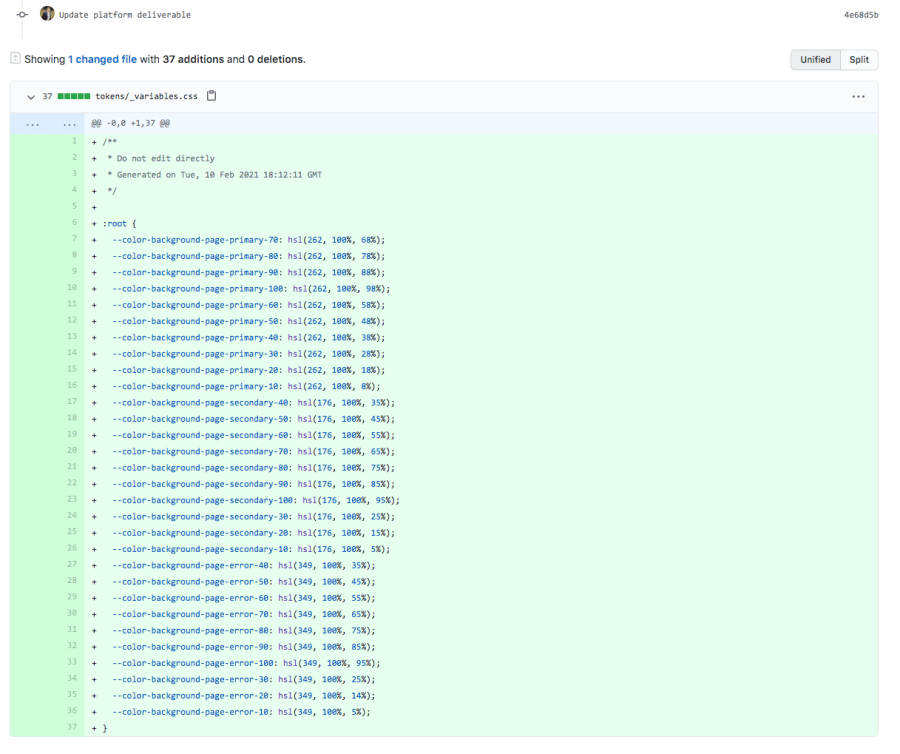
Check out the new branch, add-token-docs, that was generated on
the origin of the Docusaurus repository.
Next, let’s talk about what we want our Docusaurus documentation to look like after our changes.
I’m picturing that we’ll create a dropdown called “Tokens” and have a Markdown file for every platform deliverable that is exported by Style Dictionary.
To do this, let’s update sidebars.js in the Docusaurus project to
have just this dropdown:
// sidebars.js
module.exports = {
  someSidebar: {
    Tokens: [],
  },
};
We’ll need to populate the Tokens dropdown with Markdown articles
for every platform deliverable.
One way to do this would be to write a Node script that reads every file in
the tokens directory (containing all our platform deliverables)
and creates a Markdown file in the docs folder.
The contents of the Markdown file will be a table with the key-value pair of every token.
In our case, the script should generate a docs/CSS.md file with a
table containing a cell for the CSS variable keys and their values.
Create a file called generateTokenDocs.js:
// generateTokenDocs.js
const fs = require("fs");

const TOKENS_FOLDER = './tokens/';

fs.readdirSync(TOKENS_FOLDER).forEach(file => {

});
We are in a position to read every file in the tokens folder and
do something with the file.
Using the Node Path API, we can
parse the extension of the file
and strip the . to get the name of the Markdown file to be
generated:
// generateTokenDocs.js
fs.readdirSync(TOKENS_FOLDER).forEach(file => {
  const extension = path.parse(file).ext;
  const docName = extension.replace(".", "").toUpperCase();
});
Now, the tricky part. We have to grab only the CSS variables from the file.
The good thing is that just a little bit of regex can be applied to the contents of the file to get what we need.
// generateTokenDocs.js
fs.readdirSync(TOKENS_FOLDER).forEach(file => {
  const extension = path.parse(file).ext;
  const docName = extension.replace(".", "").toUpperCase();

  const contents = fs.readFileSync(`${TOKENS_FOLDER}${file}`, 'utf-8');

  const cssVariableMatcher = /--.+: .+(?=;)/gm;
  const variables = contents.match(cssVariableMatcher);
});
The contents are grabbed by using fs.readFileSync which is part
of the
Node File System API. Applying the regex on the contents, we get the variables from the file.
The next step is to generate the contents for the new Markdown file.
Looking at the example doc.md, we need to include some metadata
in the markdown file to wire up the sidebar configuration as well as
specifying the title and slug:
---
id: doc1
title: Style Guide
sidebar_label: Style Guide
slug: /
---
We can start preparing the Markdown for the CSS tokens doc by writing out the metadata.
// generateTokenDocs.js
fs.readdirSync(TOKENS_FOLDER).forEach(file => {
  const extension = path.parse(file).ext;
  const docName = extension.replace(".", "").toUpperCase();

  const contents = fs.readFileSync(`${TOKENS_FOLDER}${file}`, 'utf-8');

  const cssVariableMatcher = /--.+: .+/gm;
  const variables = contents.match(cssVariableMatcher);

  const markdown = `
  ---
  id: ${docName}
  slug: /
  sidebar_label: ${docName}
  title: ${docName} Tokens
  ---
  `;
});
Next, we append a Markdown table containing the key-value pairs as table cells in a row.
// generateTokenDocs.js
fs.readdirSync(TOKENS_FOLDER).forEach(file => {
  const extension = path.parse(file).ext;
  const docName = extension.replace(".", "").toUpperCase();

  const contents = fs.readFileSync(`${TOKENS_FOLDER}${file}`, 'utf-8');

  const cssVariableMatcher = /--.+: .+(?=;)/gm;
  const variables = contents.match(cssVariableMatcher);

  const keyValueRows = variables.map(variable => {
    const [key, value] = variable.split(":");
    return `| ${key} | ${value} |`;
  });

  const markdown = `
  ---
  id: ${docName}
  slug: /
  sidebar_label: ${docName}
  title: ${docName} Tokens
  ---
  | Key | Value |
  | ------------- | ------------- |
  ${keyValueRows.join("\n")}
  `;
});
We want the slug to be / since it’s the default file
in our “Tokens” sidebar.
The key and value in each string within variables are split into
an array.
Then, the key and value are injected into a Markdown table row template containing two separate table cells.
The keyValueRows are then transformed from an array back into a
string with a line break after each row.
We’re now ready for the final step of this script which is to write the new
Markdown file to the docs folder with the name and contents we’ve
created.
// generateTokenDocs.js
const fs = require("fs");
const path = require("path");
+ const prettier = require("prettier")

+ const DOCS_FOLDER = './docs/';
const TOKENS_FOLDER = './tokens/';

fs.readdirSync(TOKENS_FOLDER).forEach(file => {
  const extension = path.parse(file).ext;
  const docName = extension.replace(".", "").toUpperCase();

  const contents = fs.readFileSync(`${TOKENS_FOLDER}${file}`, 'utf-8');

  const cssVariableMatcher = /--.+: .+(?=;)/gm;
  const variables = contents.match(cssVariableMatcher);

  const keyValueRows = variables.map(variable => {
    const [key, value] = variable.split(":");
    return `| ${key} | ${value} |`;
  });

  const markdown = `
  ---
  id: ${docName}
  slug: /
  sidebar_label: ${docName}
  title: ${docName} Tokens
  ---
  | Key | Value |
  | ------------- | ------------- |
  ${keyValueRows.join("\n")}
  `;

+  const data = prettier.format(markdown, {
+    parser: "markdown",
+  });

+  fs.writeFileSync(`${DOCS_FOLDER}${docName}.md`, data)
});
We can utilize Prettier to format our Markdown so things look nice when the new doc is created.
You’ll have to install the dependency:
npm i prettier
To run this script via NPM, we’ll add a new script to
package.json:
// package.json
"scripts": {
     // ...
+   "generate-token-docs": "node generateTokenDocs.js"
},
Let’s run npm run generate-tokens-docs to see if this is all
working.
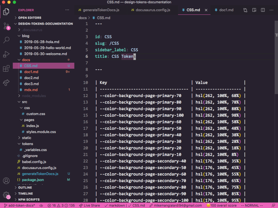
We should see a new file in our docs called
CSS.md with some nice formatting! 🎉
Now, we need our sidebars.js to include our new doc in the
Tokens list by adding the id in the metadata of our
new docs/CSS.md file:
// sidebars.js
module.exports = {
  someSidebar: {
    Tokens: [], // add "CSS" id here
  },
};
We can achieve this by having sidebars.js read the files in the
docs folder. It can look for a “tag” in the metadata to know that
it belongs in the sidebar.
First, let’s go back to generateTokenDocs.js add a “tokens” tag
to the Markdown contents:
// generateTokenDocs.js
 const markdown = `
 ---
 id: ${docName}
 slug: /
 sidebar_label: ${docName}
 title: ${docName} Tokens
+ tags: [tokens]
 ---
 | Key | Value |
 | ------------- | ------------- |
 ${keyValueRows.join("\n")}
 `;
Run npm run generate-tokens-docs one more time to generate the
file that should now contain the tags metadata.
Then, we can update sidebars.js to populate the
Tokens with the id from any file that contains a
“tokens” tag:
// sidebars.js
const fs = require("fs");

const DOCS_FOLDER = "./docs/";

let tokens = [];

fs.readdirSync(DOCS_FOLDER).forEach((file) => {
  const contents = fs.readFileSync(`${DOCS_FOLDER}${file}`, "utf-8");

  const tagsMatcher = /tags: \[.*\]/gm;
  const tags = contents.match(tagsMatcher);
  if (tags && tags[0].includes("tokens")) {
    const idMatcher = /id: .*/gm;
    const id = contents.match(idMatcher)[0].split(":")[1].trim();
    tokens.push(id);
  }
});

module.exports = {
  someSidebar: {
    Tokens: tokens,
  },
};
The true test will be to run npm run start and see if the CSS
tokens doc is showing up on the “Docs” page.
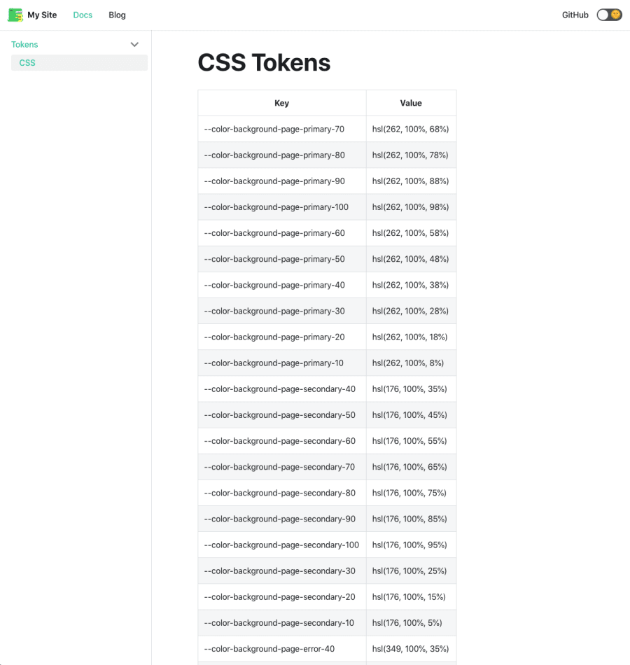
Woohoo! It works! 🎉
Improving Our Design Tokens Documentation Process
The sky’s the limit for what you can do with the power of Docusaurus, but I won’t be diving into that.
However, I do want to call out some ways that the process for generating documentation for design tokens could be improved.
First, we only handled the scenario where there is a single platform deliverable, CSS tokens.
If we want to handle the documenting of additional platform deliverables, our
generateTokenDocs.js script will have to become more robust.
It will need to either generalize the logic to extract the key-value pairs or handle each file extension differently and have custom logic for each platform deliverable.
We won’t do that together, but I wanted to provide the heads up.
Second, we can automate the generation of the token docs.
We can do this by adding a GitHub Actions workflow in our Docusaurus
repository that will run the
npm run generate-tokens-docs script whenever new tokens are
received.
Let’s create a
.github/workflows/generate-docs-on-tokens.yml file.
# generate-docs-on-tokens.yml
name: Generate Docs On Tokens

on:
  push:
    paths:
      - "tokens/**"

jobs:
  generate_token_docs:
    runs-on: ubuntu-latest
    steps:
      - uses: actions/checkout@v2
      - uses: actions/setup-node@v2
        with:
          node-version: "12"
      - name: Install Node Dependencies
        run: npm install
      - name: Generate Token Docs
        run: npm run generate-token-docs
      - name: Commit Generated Platform Deliverables
        id: "auto-commit-action"
        uses: stefanzweifel/git-auto-commit-action@v4
        with:
          commit_message: Update token docs
This workflow is very similar to the workflow in the
style-dictionary repository to
generate design tokens with Style Dictionary when it receives the design
tokens from a design file.
With our new workflow, it will run the
npm run generate-token-docs and commit the files generated during
the workflow.
Let’s commit and push our code.
To test this automation all the way through, let’s go back to the
style-dictionary repository and update the
output/css/_variables.css file one more time:
- --color-background-page-primary-70: hsl(262, 100%, 68%);
+ --color-background-page-primary-70: hsl(162, 100%, 68%);
We’ll modify the first variable in the file to have a hue of 162 instead of 262.
Push this change.
After both workflows run (first in style-dictionary then in the
Docusaurus repository), we should see that the docs/CSS.md was
modified with the change!
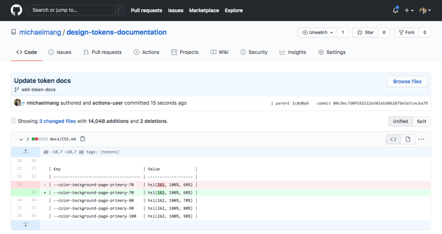
So cool! 🎉
Here is the final code for the
style-dictionary repository:
https://github.com/michaelmang/style-dictionary/pull/5
Here is the final code for the Docusaurus repository:
https://github.com/michaelmang/design-tokens-documentation/pull/1
Conclusion
I hope that this article gives you a clear direction on how to automate the generation of documentation for design tokens exported by Style Dictionary.
I also hope that it gives you a sampling of the Docusaurus which you can use for more than just design tokens documentation.
In my next article, I go over integrating design tokens with Tailwind.
If you’re interested in the ebook version of these articles, the easiest thing would be to subscribe to my newsletter where I’ll provide updates.
Cheers! Pow, discuss, and share.

